How I think Blogger will be useful for my coursework.
- Helps me to gain inspiration from other blogs that I can easily access
- Other people can view my work more freely
- Other people can gain inspiration from my blog
- The layout could potentially make my coursework easier to understand
- Blogger is a place to store my coursework without fear of it being lost
- Makes it easy to share my coursework
Things you can do with Blogger.
- Post and update anything
- Share your ideas with other people easily
- Easily view previous ideas and improve on previous posts
- Share photographs
- Voice opinions
- Store creative ideas
- View other blogs and get inspiration for your own
- Share your ideas with other people easily
- Easily view previous ideas and improve on previous posts
- Share photographs
- Voice opinions
- Store creative ideas
- View other blogs and get inspiration for your own
Magazines and Audiences (Part 1)
Glossary
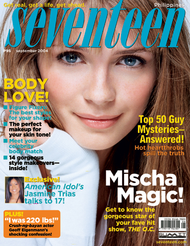
Masthead – The name/title of the magazine. This is usually done in a unique font that is recognisable to the reader.
Dateline – Month and year of publication and often placed with the price. A magazine will usually hit the shops the month or season before the cover date.
Main Image – The main image is what may catch the reader’s eye and draw attention to the publication. The main image should relate to the target audience in some way.
Cover lines - Cover lines are distributed around the main image without being too distracting. The cover lines should never cover the face of a person used in a main image.
Main cover line – This is the largest cover line, it promotes an article that is included in the magazine and is maybe the main reason why someone would purchase it.
Left third – When stacked on a stall or in a news agents the left third is usually all that will be shown so the title must be easily recognisable and stand out as well as show what is in the magazine before the reader has had a proper look at the cover.
Bar code – Standard barcode used by retailers.
Selling line – Short and sharp description of the magazine and the main selling point or maybe setting out its editorial philosophy.
Advertorial – Advertising material that is used to look like editorial.
Plugs - Information about the contents of the magazine or newspaper given on the front of the cover.
Motto - A phrase that can be linked to the magazine so it is recognisable.
Lead - The introduction paragraph to a piece this is usually in bold.
Copy - Main Story of a magazine.
Puffs - Usually stands out from the other text on page, usually in bright colours. This usually shows promotional offers.
Buzz Words - "Exclusive" and “wow” are examples of Buzz Words.
Magazines and Audiences (Part 2)

This Magazine is aimed at people aged 17- 40 because it is a music magazine that shows recent music and up and coming bands but it also pictures Ian Curtis as the Main Image which will be a recognisable image for fans of Joy Division, a band who were around in the 1970’s so will make the magazine appeal to an older audience as well as a younger one.
This magazine will stand out on a shelf because the cover is in black and white but the Masthead is in red, which is what your eyes will automatically go to, and make you notice the magazine as well as NME being a well recognisable logo. This cover will appeal to a younger generation because the use of bands on the front for example “blur” may remind them of what they listened to growing up with their parents or on the radio also if they are interested in recent music news. It may also appeal to older generations who remember, “blur” from when they were younger and want to find out about their reunion.
The Third Left is obviously showing the main features of the magazine and the main selling point for when the magazines are stacked on shelves. NME written in red draws attention to the magazine but also the text underneath it. The magazine is presented neatly and has stuck to a theme of black, white and red to appeal to a more formal audience. The cover lines are evenly distributed and don’t cover the face of the Main Image which is a rule that keeps the magazine looking tidy. If a magazine looked messy with things popping out everywhere and a use of incorrect colours could persuade someone to stay away from the magazine. The plugs on the front cover don’t give a lot away about the contents but it still captures an essence of the article and shows enough to make you interested in buying the issue.
To what extent should magazines be held responsible for social ramifications of the representation they offer?
Magazines are extremely popular and influential with teenage girls. A lot of magazines stick to a similar theme which does not show diversity with people in the audiences age bracket. This could be seen as a negative outlook on a subject that has influenced girls for generations, but are the publicists really concerned about the welfare of their audience or just profit? In recent news, magazines aimed at teenage girls have been criticised for 'sexualising readers'. This statement is true to some extent as these magazines are showing women older then the target audience and they can be unrealistic role models. Especially with celebrities like Miley Cyrus recently in headlines with suspected drug use. This is not a positive role model for young girls who are easily influenced and may get involved in similar crimes in the future and view it as acceptable. They also show pictures of girls in minimal clothing, especially in the summer, which could make people who don't have that certain figure feel insecure about themselves which could affect them in the long term as well as in the short term.
 The women depicted in these magazines do not often show that you have to work hard to be successful so it does not give kids something to aspire to in terms of education. It may make them feel that if they don't have a good singing voice then they will never aspire to anything. Most of the women on these magazines are still young and became famous at a young age and could make the audience feel like a failure if they haven't done what they want to do with life by the age of 17.
Most people on the covers of these magazines are models that don't seem to have anything different about them and they have a perfect everything. These girls need to be shown that not everyone looks like a model and not every girl with be skinny and have perfect hair and make-up everyday. This is another unrealistic factor that girls shouldn't have to deal with at a young age, it is apparent that our media is obsessed by the way people look.
 Although these magazines are in fact aimed at teenage girls they can also influence teenage boys who may not like to admit it, but do have access to these magazines and can also be negatively influenced by the content. These magazines show men in a very particular light and they are represented as very strong and well groomed. This can affect teenage boys who feel like they are nothing like these men and that girls are nothing like the women shown, but it can also affect teenage girls who wont understand that it is not what all men are like.
These magazines could benefit teenage girls by having a look at what they could change and why they are changing it. In my opinion there should be a more diverse type of cover girl to appeal to a wider audience and also to show that everybody is different and can be individual in their own way. Publicists should look at getting rid of weight related 'real stories' as this can make a girl very conscious of what she looks like or who she's viewed as. Another idea would be to show all types of boys that can help a girls and a boys self esteem.
The age group that I am aiming my magazine towards are teenagers aged 16-19, as they are the main age group of students that attend college. Aiming this magazine at people aged 30-36 would be pointless because there would be no market for this type of magazine.
Preliminary Task
My magazine will be mainly about college and college life; things that are available to students around college, changes in facilities and things that are happening around college. The students will also be given a chance to write their own articles because if students have their own chance to get involved then they will be more likely to read the magazine and it will help anyone looking for experience.
I think that I should call my magazine ‘SCD’ because it’s short and catchy and easily recognisable to people who attend South Downs College. Rejected titles include ‘College Life’; I rejected this option because it sounds cheesy and would not appeal to teenager. I also rejected ‘South Downs College Magazine’ because it is a lot to say and isn’t catchy, people would not like this name for a magazine because it’s too long and the text would not look good on the front cover.
Fonts that I rejected are; Times New Roman, Comic Sans and Drop Caps. I rejected Times New Roman because it is too formal and looks like a lot to read, as the font tends to be quite small. I rejected Comic Sans and Drop Caps because they are both very playful fonts and don’t give a professional impression. The magazine should not be taken too seriously but it should not be a taken for granted. I want to use the font Ariel Narrow because the font is quite formal but not too much to read and it doesn’t look like a harsh text on a page especially in big clumps of text.
I want this magazine to be published around autumn time of year because it is the time of year when it is starting to get cold and everyone needs something to cheer them up so this magazine could be that. It could also be a great thing to curl up in bed with as something to read instead of something like a film or a TV show. This magazine should promote the idea that being in front of screens all day is a bad thing.
I want a picture of a student wrapped up warm with brown leaves as my main image on the cover. This will reflect the idea that it is autumn and that the season is changing. I also want to reflect this by showing typical autumn colours like deep reds, browns and oranges.
I want this magazine to be published quarterly just as the seasons are changing so that the magazine has the same affect in each season; taking the magazine to the beach in the summer etc.